


1.メッセージの実装
HTML実装
<div class="message">
<div class="message__body">
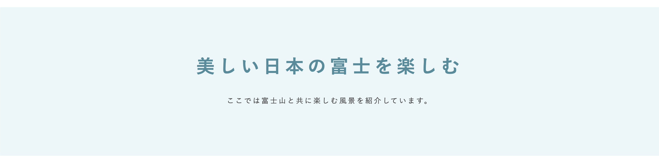
<h3 class="message__body-title">美しい日本の富士を楽しむ</h3>
<p class="message__body-p">ここでは富士山と共に楽しむ風景を紹介しています。</p>
</div>
</div>
CSS実装(PC編)
.message {
  padding-top: 96px;
  padding-bottom: 100px;
  background-color: #ebf6f8;
}
.message__body {
  text-align: center;
}
.message__body-title {
  font-size: 36px;
  letter-spacing: 0.2em;
  line-height: 1;
  color: #4a8c9c;
}
.message__body-p {
  padding-top: 43px;
  font-size: 14px;
  letter-spacing: 0.2em;
  line-height: 1;
}
CSS実装(スマホ編)
@media all and (max-width: 767px) {
  .message {
    padding-top: 51px;
    padding-bottom: 50px;
  }
  .message__body-title {
    font-size: 20px;
  }
  .message__body-p {
    padding-top: 15px;
    font-size: 11px;
  }
}
実装解説
メッセージは特に難しい部分はないと思います。
2.アバウトの実装
アバウトの実装は、「2-3. カラムの配置が変わるレイアウトの実装」でやったレイアウトです。
HTML実装
<div class="about">
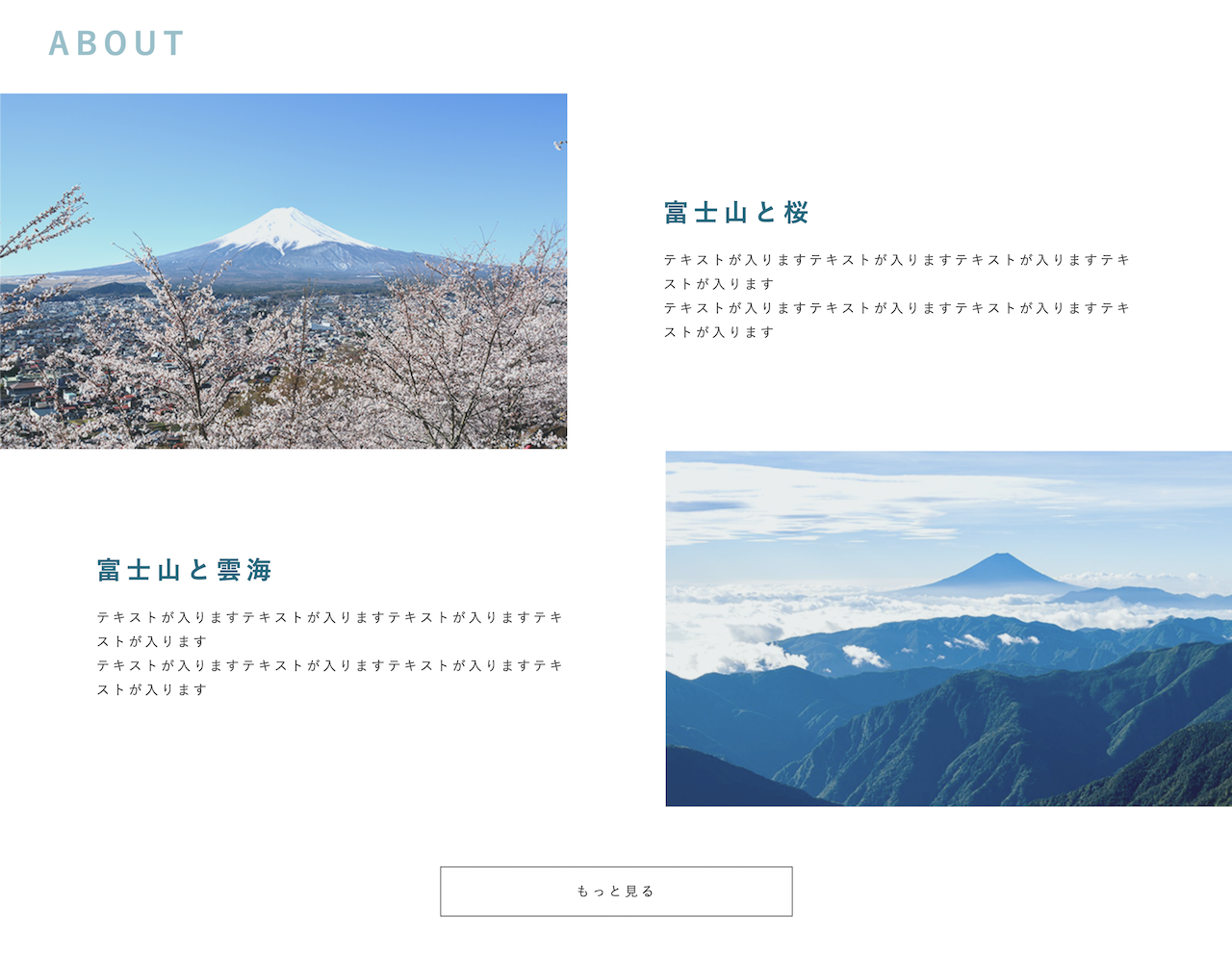
<h3 class="about__title head-text">ABOUT</h3>
<div class="about__body">
<div class="about__body-item">
<div class="about__body-item-img">
<picture>
<source media="(max-width: 767px)" srcset="./img/about_img01_sp.png"/>
<img src="./img/about_img01.png" alt="">
</picture>
</div>
<div class="about__body-item-texts">
<div class="about__body-item-texts-copy">富士山と桜</div>
<p class="about__body-item-texts-p">テキストが入りますテキストが入りますテキストが入りますテキストが入ります<br>
テキストが入りますテキストが入りますテキストが入りますテキストが入ります</p>
</div>
</div>
<div class="about__body-item about__body-item--reverse">
<div class="about__body-item-texts">
<div class="about__body-item-texts-copy">富士山と雲海</div>
<p class="about__body-item-texts-p">テキストが入りますテキストが入りますテキストが入りますテキストが入ります<br>
テキストが入りますテキストが入りますテキストが入りますテキストが入ります</p>
</div>
<div class="about__body-item-img">
<picture>
<source media="(max-width: 767px)" srcset="./img/about_img02_sp.png"/>
<img src="./img/about_img02.png" alt="">
</picture>
</div>
</div>
<div class="about__body-more">
<a class="link-more" href="#">もっと見る</a>
</div>
</div>
</div>
CSS実装(PC編)
.about {
  margin: 0 auto;
  padding-top: 78px;
  max-width: 1280px;
}
.about__title {
  padding-left: 50px;
  padding-bottom: 36px;
}
.about__body {
}
.about__body-item {
  display: flex;
  align-items: center;
}
.about__body-item-img {
  width: 46%;
}
.about__body-item-img img {
  width: 100%;
}
.about__body-item-texts {
  box-sizing: border-box;
  padding-right: 7.8%;
  padding-left: 7.8%;
  width: 54%;
}
.about__body-item-texts-copy {
  font-size: 26px;
  letter-spacing: 0.2em;
  line-height: 1;
  font-weight: bold;
  color: #006a80;
}
.about__body-item-texts-p {
  padding-top: 25px;
  font-size: 14px;
  letter-spacing: 0.2em;
  line-height: 1.8;
}
.about__body-more {
  padding-top: 60px;
}
.about__body-more a {
  margin: 0 auto;
}
PC 実装解説
.about__body-item に display: flex; を指定して、画像とテキストを横並びにします。
画像とテキストはブラウザサイズに合わせて可変させたいので%指定にします。
.about__body-item-img に width: 46%;
.about__body-item-texts に width: 54%;
合計で100%になるようにしましょう。
画像は .about__body-item-img にぴったり収まるよう100%で指定します。
.about__body-item-img img に width: 100%;
CSS実装(スマホ編)
@media all and (max-width: 767px) {
  .about {
    padding-top: 58px;
  }
  .about__title {
    padding-left: 0;
    padding-bottom: 24px;
    text-align: center;
  }
  .about__body-item {
    flex-direction: column;
  }
  .about__body-item--reverse {
    flex-direction: column-reverse;
  }
  .about__body-item-img {
    width: 100%;
  }
  .about__body-item-texts {
    padding-top: 25px;
    padding-right: 10px;
    padding-bottom: 48px;
    padding-left: 10px;
    width: 100%;
  }
  .about__body-item-texts-copy {
    font-size: 16px;
  }
  .about__body-item-texts-p {
    padding-top: 10px;
    font-size: 10px;
  }
  .about__body-more {
    padding-top: 0;
  }
}
スマホ 実装解説
.about__body-item に flex-direction: column; を指定して縦並びにします。
2つ目の要素は逆向きにしたいので、
.about__body-item--reverse にflex-direction: column-reverse; とします。
3.インタビューの実装
インタビューの実装は、「2-4. フレックスボックスの実装」と似ている実装を行います。
HTML実装
<div class="interview">
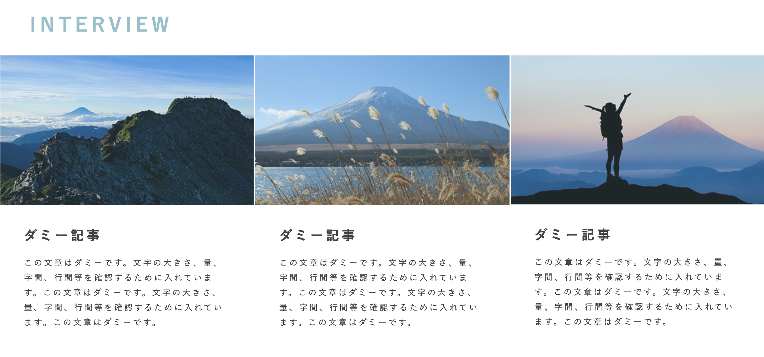
<h3 class="interview__title head-text">INTERVIEW</h3>
<div class="interview__body">
<div class="interview__body-item">
<a href="#">
<div class="interview__body-item-img">
<picture>
<source media="(max-width: 767px)" srcset="./img/interview_img01_sp.png"/>
<img src="./img/interview_img01.png" alt="">
</picture>
</div>
<div class="interview__body-item-texts">
<div class="interview__body-item-texts-title">ダミー記事</div>
<p class="interview__body-item-texts-p">この文章はダミーです。文字の大きさ、量、字間、行間等を確認するために入れています。この文章はダミーです。文字の大きさ、量、字間、行間等を確認するために入れています。この文章はダミーです。</p>
</div>
</a>
</div>
<div class="interview__body-item">
<a href="#">
<div class="interview__body-item-img">
<picture>
<source media="(max-width: 767px)" srcset="./img/interview_img02_sp.png"/>
<img src="./img/interview_img02.png" alt="">
</picture>
</div>
<div class="interview__body-item-texts">
<div class="interview__body-item-texts-title">ダミー記事</div>
<p class="interview__body-item-texts-p">この文章はダミーです。文字の大きさ、量、字間、行間等を確認するために入れています。この文章はダミーです。文字の大きさ、量、字間、行間等を確認するために入れています。この文章はダミーです。</p>
</div>
</a>
</div>
<div class="interview__body-item">
<a href="#">
<div class="interview__body-item-img">
<picture>
<source media="(max-width: 767px)" srcset="./img/interview_img03_sp.png"/>
<img src="./img/interview_img03.png" alt="">
</picture>
</div>
<div class="interview__body-item-texts">
<div class="interview__body-item-texts-title">ダミー記事</div>
<p class="interview__body-item-texts-p">この文章はダミーです。文字の大きさ、量、字間、行間等を確認するために入れています。この文章はダミーです。文字の大きさ、量、字間、行間等を確認するために入れています。この文章はダミーです。</p>
</div>
</a>
</div>
</div>
</div>
CSS実装(PC編)
.interview {
  margin: 0 auto;
  padding-top: 78px;
  max-width: 1280px;
}
.interview__title {
  padding-left: 50px;
  padding-bottom: 36px;
}
.interview__body {
  display: flex;
}
.interview__body-item {
  margin-left: 2px;
}
.interview__body-item a {
  text-decoration: none;
  color: #444444;
}
.interview__body-item-img {
  width: 100%;
}
.interview__body-item img {
  width: 100%;
}
.interview__body-item:first-child {
  margin-left: 0;
}
.interview__body-item-texts {
  padding-top: 30px;
  padding-right: 40px;
  padding-bottom: 30px;
  padding-left: 40px;
}
.interview__body-item-texts-title {
  font-size: 22px;
  letter-spacing: 0.2em;
  line-height: 1.8;
  font-weight: bold;
}
.interview__body-item-texts-p {
  padding-top: 14px;
  font-size: 14px;
  letter-spacing: 0.2em;
  line-height: 1.8;
}
PC 実装解説
横並びにするために
.interview__body に display: flex;
画像は常に最大幅にしたいので
.interview__body-item-img に width: 100%;
記事ごとに間隔を開けたいので
.interview__body-item に margin-left: 2px;
そして、1つ目の要素には必要ないので margin-left: 0; を上書きします。
.interview__body-item:first-child に margin-left: 0;
CSS実装(スマホ編)
@media all and (max-width: 767px) {
  .interview {
    padding-top: 58px;
  }
  .interview__title {
    padding-left: 0;
    padding-bottom: 38px;
    text-align: center;
  }
  .interview__body {
    flex-wrap: wrap;
    justify-content: space-between;
  }
  .interview__body-item {
    margin-left: 0;
    width: calc(50% - 1px);
  }
  .interview__body-item-texts {
    padding-top: 15px;
    padding-right: 10px;
    padding-bottom: 27px;
    padding-left: 10px;
  }
  .interview__body-item-texts-title {
    font-size: 11px;
  }
  .interview__body-item-texts-p {
    padding-top: 4px;
    font-size: 10px;
  }
}
スマホ 実装解説
スマホでは display: flex; を折り返しできるようにします。
.interview__body に flex-wrap: wrap;
そして、横並びの配置方法を変更します。
justify-content: space-between;
space-between は要素の端に要素を置くようにします。
記事の大きさを変更します。
.interview__body-item に width: calc(50% - 1px);
-1pxすることで記事の間隔をあけます。

